New DataBasic Tool Lets You “Connect the Dots” in Data
Tuesday, February 7, 2017

New DataBasic Tool Lets You “Connect the Dots” in Data
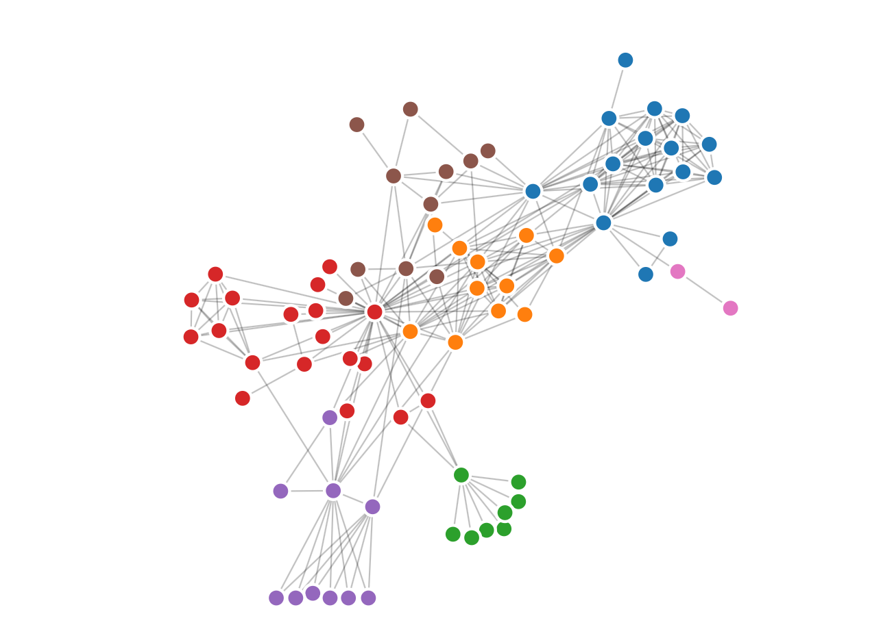
We’re thrilled to announce Catherine D’Ignazio and Rahul Bhargava have launched a new DataBasic tool and activity, Connect the Dots, aimed at helping students and educators see how their data is connected with a visual network diagram.
By showing the relationships between things, networks are useful for finding answers that aren’t readily apparent through spreadsheet data alone. To that end, D’Ignazio, an Engagement Lab Fellow and Assistant Professor in the Journalism Department at Emerson College, and Bhargava, a research scientist at the MIT Media Lab’s Center for Civic Media, have built Connect the Dots to help teach how analyzing the connections between the “dots” in data is a fundamentally different approach to understanding it.

The new tool gives users a network diagram to reveal links as well as a high level report about what the network looks like. Using network analysis helped Google revolutionize search technology and was used by journalists who investigated the connections between people and banks during the Panama Papers Leak.
Connect the Dots is the fourth and most recent addition to DataBasic, a growing suite of easy-to-use web tools designed to make data analysis and storytelling more accessible to a general and non-technical audience launched last year.
As with the previous three tools released in the DataBasic suite, Connect the Dots was designed so that its lessons can be easily planned to help students learn how to use data to tell a story.
Connect the Dots comes with a learning guide and introductory video made for classes and workshops for participants from middle school through higher education. The learning guide has a 45-minute activity that walks people through an exercise in naming their favorite local restaurants and seeking patterns in the networks that result. To get started using the tool, sample data sets such as Donald Trump’s inside connections and characters from the play Les Miserables have also been included to help introduce users to vocabulary terms and the algorithms at work behind the scenes. Like the other DataBasic tools, Connect the Dots is available in English, Portuguese, and Spanish.
Learn more about Connect the Dots and all the DataBasic tools here.
Have you used DataBasic tools in your classroom, organization, or personal projects? If so, we’d love to hear your story! Write to [email protected] and tell us about your experience.
