Storytelling with Data: Why? How? When?
Friday, December 4, 2015
By Catherine D’Ignazio
04/06/2015

From the OpenVisConf website: *Robert Kosara is Research Scientist at Tableau Research. Before he joined Tableau in 2012, he was a professor of computer science at UNC Charlotte. Robert has created visualization techniques like Parallel Sets and performed research into the perceptual and cognitive basics of visualization. Recently, his research has focused on how to communicate data using tools from visualization, and how storytelling can be adapted to incorporate data, interaction, and visualization.*
This is a liveblog account by Catherine D’Ignazio.
He leads the group through an exercise of raising hands if categories apply to you — Have you seen a movie? Read a book? People raise their hands.
Stories are all around us. We are used to them. We understand them. They work for us. He is going to talk about why that is and how we can build stories with data.
Why Stories?
He will tell a story to answer this question. It’s about a young woman who walks into a bar in Berlin in the 1920’s. She is doing her grad studies in a new field called psychology. He shows a slide of a cat. You all are now paying attention.
We tell stories because they get our attention. We also tell them because they are memorable. This is like “stickiness”. This is part of the process of communication of data — what do you want people to do with your data? If you just throw bar charts at people they won’t remember them.
But the way memory works is not like a computer. We don’t just store info in our brains. Little bubbles float around in our head and you try — like with velcro — to hook those memories. The way memory works — you have to remember something to remember something else. They give you connective tissue between items of information. Stories have used for many years to convey information to the next generation. There are some arguments that say that stories predate complex language.
How to tell Stories with Data?
There are two parts to this. One is techniques and one is structure. There are visualization techniques specific to storytelling — “presentation-only techniques”. These are techniques you would never use in the exploration phase, only in the communication phase.
For example he shows Hannah Fairfield’s graphic about driving safetywhich shows number of fatalities that change as number of miles driven increases.
Here she turned a bunch of numbers into something interesting to explore. It is accompanied by a story. These techniques are powerful when they are used the right way.
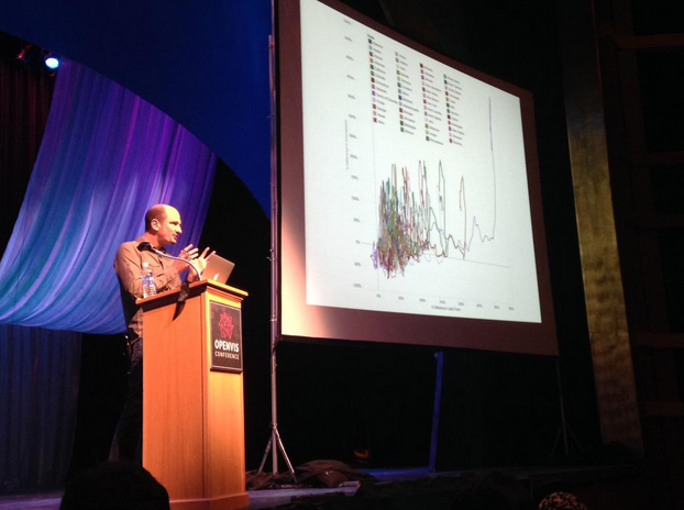
This technique, according to academics, is also really bad. Because it could lead to a “hairball line chart”.

He shows the ebb and flow of movies from the NYTimes. Things like this work well for promoting exploration because they get people interested even though they might counteract academic wisdom about data graphics.
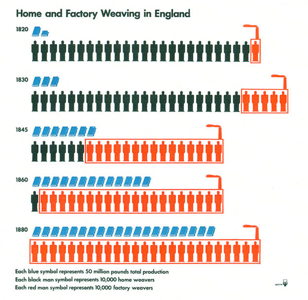
He shows ISOTYPE visualizations. This uses symbols to show numbers. Over time the number of people changes. This graphic tells the story of the industrial revolution.
ISOTYPE stands for International System of Typographic Picture Education. Developed by Marie Neurath, her husband Otto Neurath, and Gerd Arntz

He then shows the famous chart of Napolean’s march into Russia popularized by Edward Tufte. This is another example of a chart that worked well for a singular purpose and has never been able to be used again. It is valuable to do very specific things but we have to appreciate how specific they are.
Now he is moving to the “Structure” part of the How. He shows an example about the Copenhagen talks. It’s an example of a “stepper”, a slide-based visualization that explains how carbon emissions are changing over time. Total emissions looks very different from emissions per capita. Or if you plot it against GDP then things look again different.
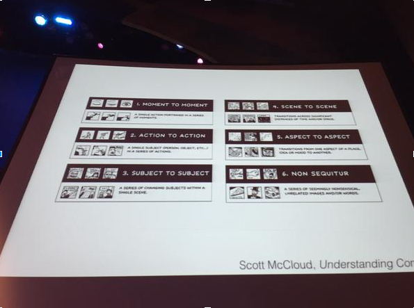
He disagrees with the notion that scrolling automatically makes things feel continuous for the user. What people remember are events. He is against animation except for transitions. If you look at the steppers as small multiples then you see them as comics. Scott McCloud says that comics are “the sequential art”. Each frame is an event but there is time passing between them. There is a change between frames and there are different ways of changing those frames. He recommends Understanding Comics to everyone.
If you want to tell a story about anything — people or data — you will find that some of those rules will apply.
He mentions Neil Cohn — Visual Narrative Structure. Establish — Initial — Peak — Release. This makes a narrative arc. Could we map some of those small multiples about carbon emissions to this structure — Establish — Initial — Peak — Release?
You can think about views that you created in relation to this to structure a story.
When do you tell stories?
He asks why the audience remembers the details of the story from the beginning. Why? Perhaps because he hasn’t told us the punchline. She was a famous psychologist — Bluma Zeigarnik. She proposed the “Zeigarnik Effect” — we remember things that are unfinished. We remember the story until it is unfinished. We have to remember the pieces of it until the end. It’s an effective way of getting people to remember things — the “Cliffhanger”. You want to keep watching or binge watch on Netflix.
*(Cross posted at the MIT Center for Civic Media)*